Description
We came up with the project to build Hello with a friend in late 2014.
The app was functional and nearly ready to launch in January (see design here), but the project was aborted because of the loss of my computer on which all the data was stored.
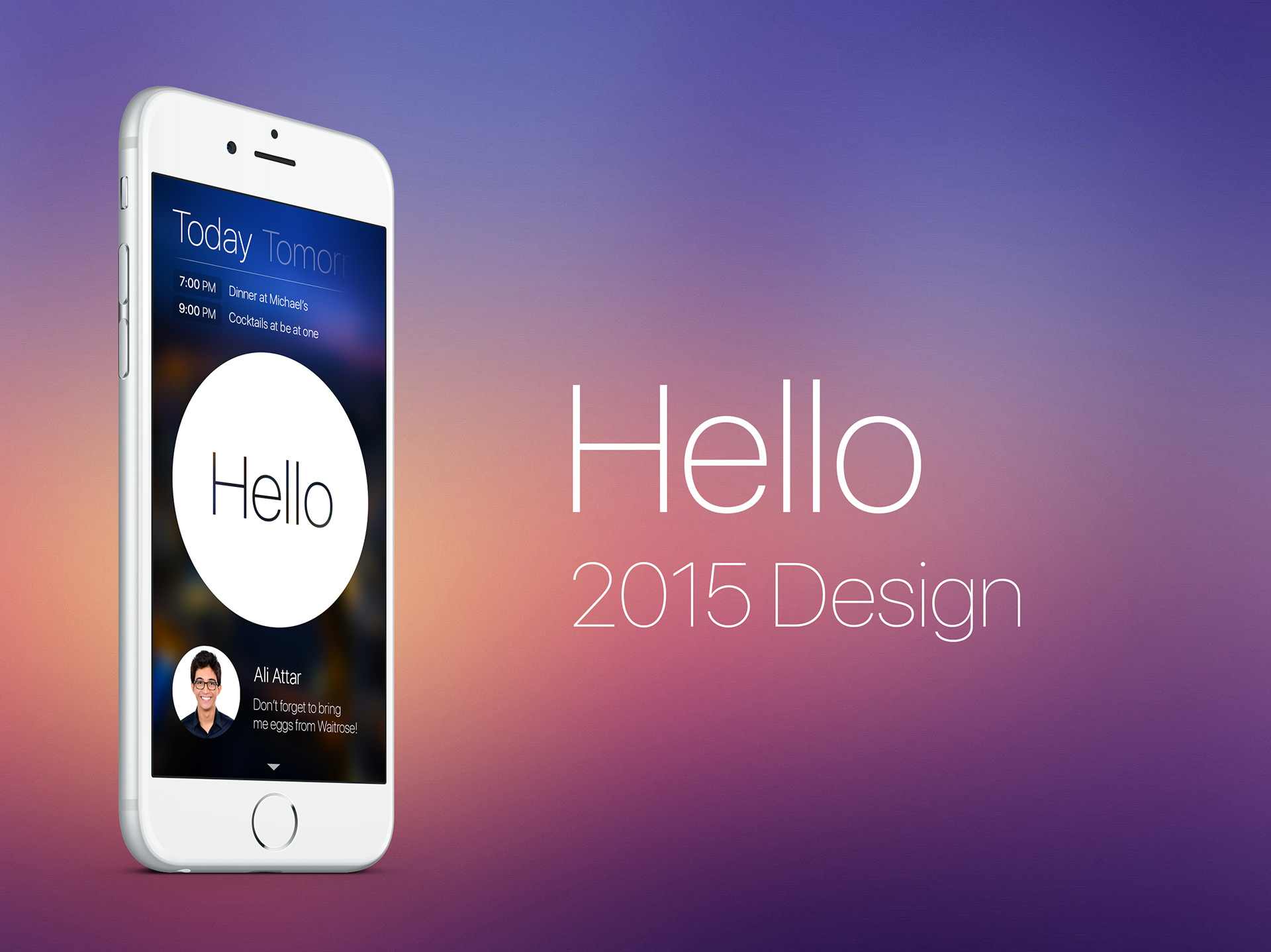
We restarted Hello as part of theBlurr's WHO project in March 2014 with this fresh new design. Most of the design will be presented as screenshots to allow mobile users to feel what the app would look like on their device.
Please note the design is not 100% final and the app is in development.
I hope you will like it!
Splash Screen
New logo, modern style, blurred background from theBlurr… Everything is better.
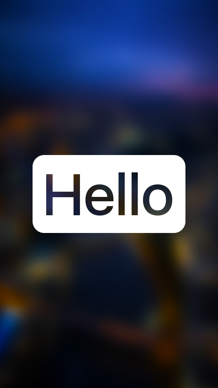
Do you like the new logo?
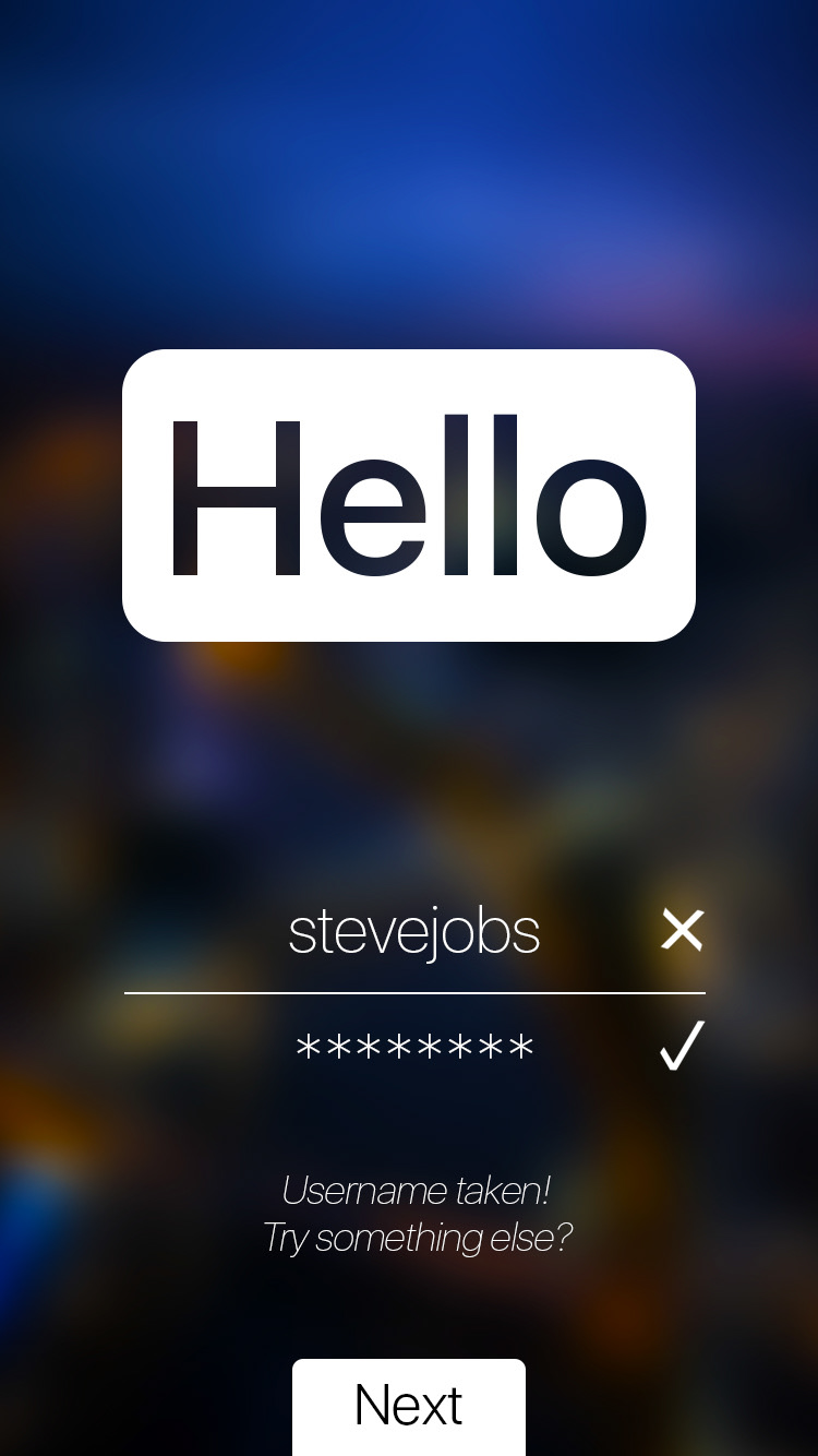
Signing up and Logging in
The rounded rectangle moves up.


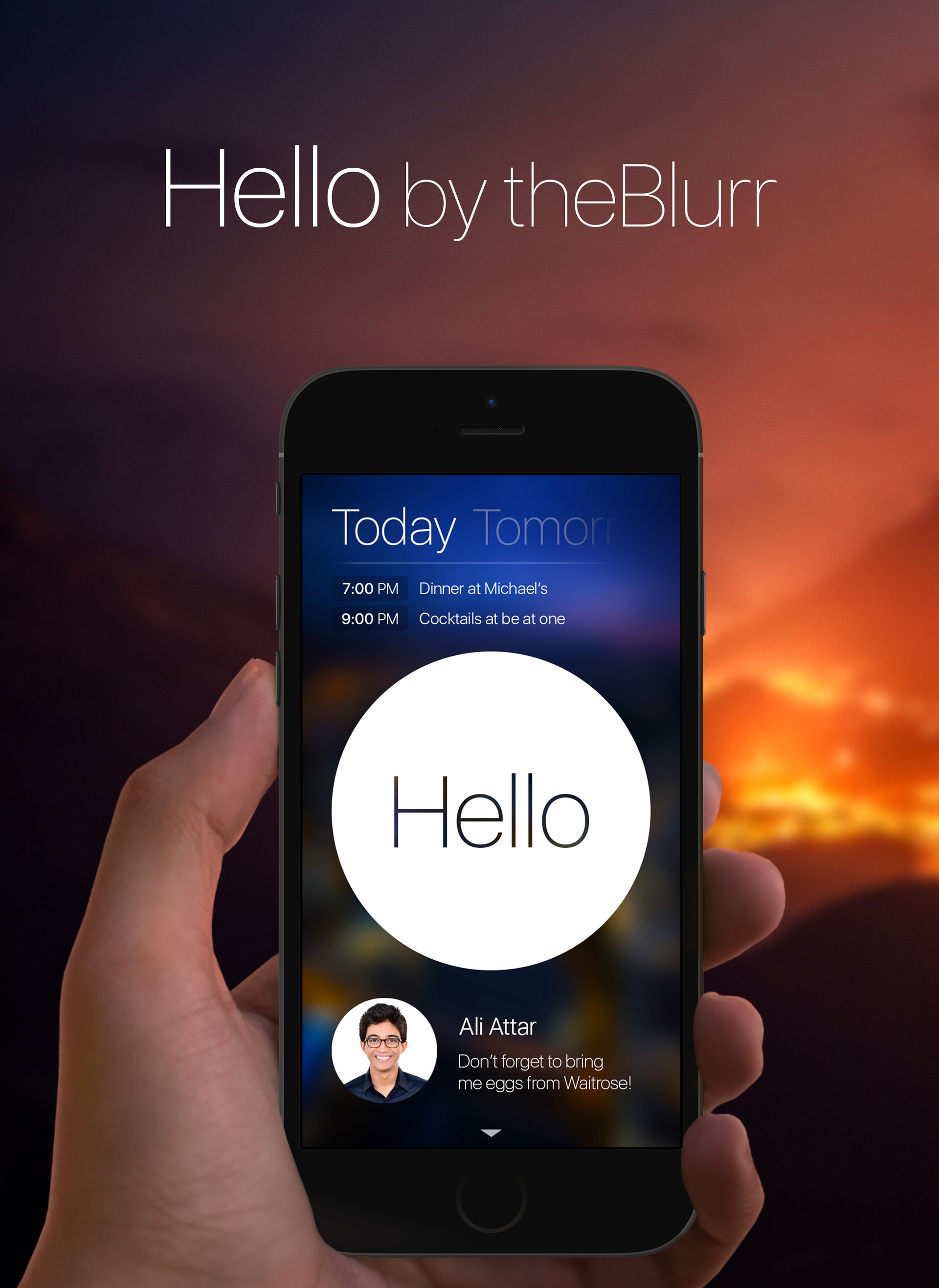
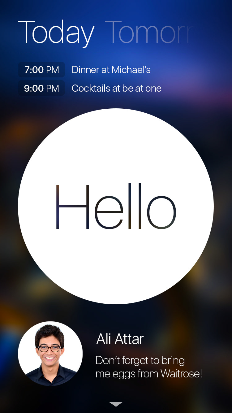
Welcome Screen
This screen corresponds to the Home View Controller for the app.
There are now two kinds of Hellos: Events and Tasks.
At the top of the page, the user will find the fast event browser. By swiping left or right, the user can go through the events happening today, tomorrow, in a week, etc… He can also go back and see what happened yesterday and before so. Tapping on an event will display the hello.
By swiping from top to bottom, the calendar view (not displayed here) will appear to browse through all events.
By swiping from top to bottom, the calendar view (not displayed here) will appear to browse through all events.
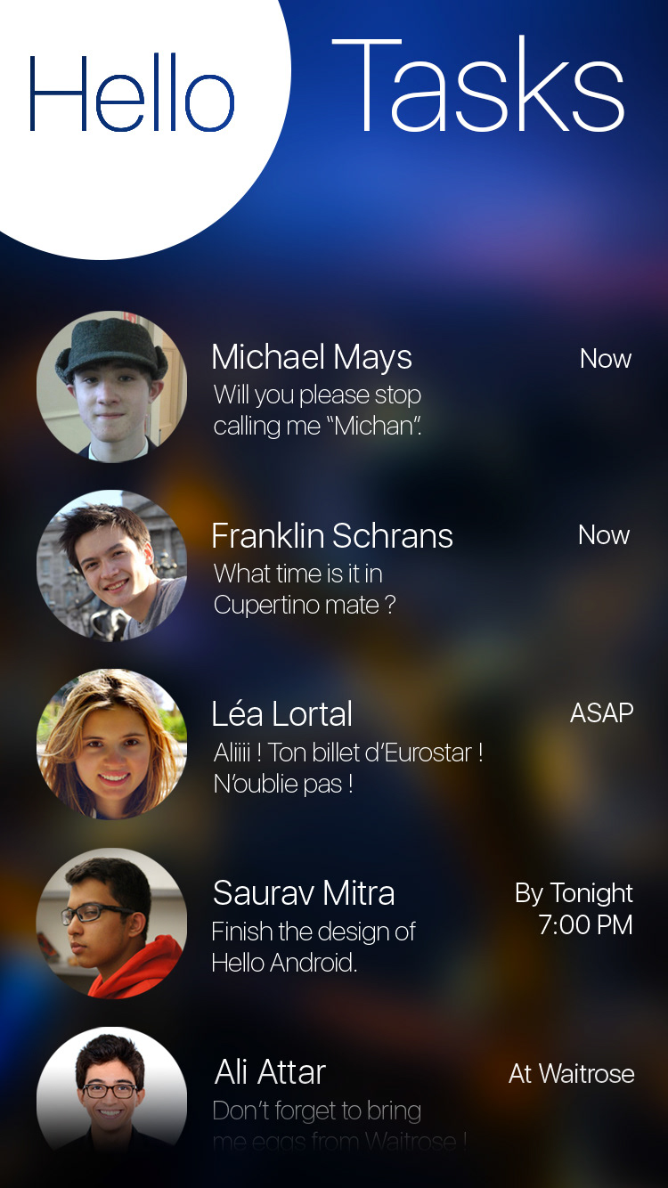
At the bottom of the page, the user will see the Tasks requested by his friends. Each task will stay for a 10 seconds each before a rolling animation shows the next one. By swiping the task to the right, the user can mark it as complete (not shown here, otherwise too many screens!). Tapping on a task will display the Hello.
By swiping from bottom to top, the task view (see below) will appear to browse through all events.
Other designs for the Welcome Screen
I went through multiple backgrounds and designs before agreeing on the final one with the other cofounders. The first image corresponds to multiple cool backgrounds (generated from my pictures) that I tried before finding theBlurr's image. The second image shows the two final designs: light and dark.
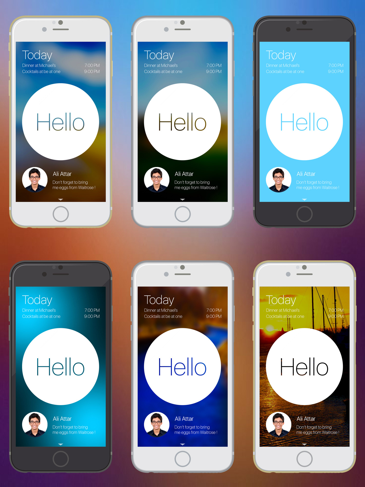
Oh and there were a lot more trials!
My two favorite designs.
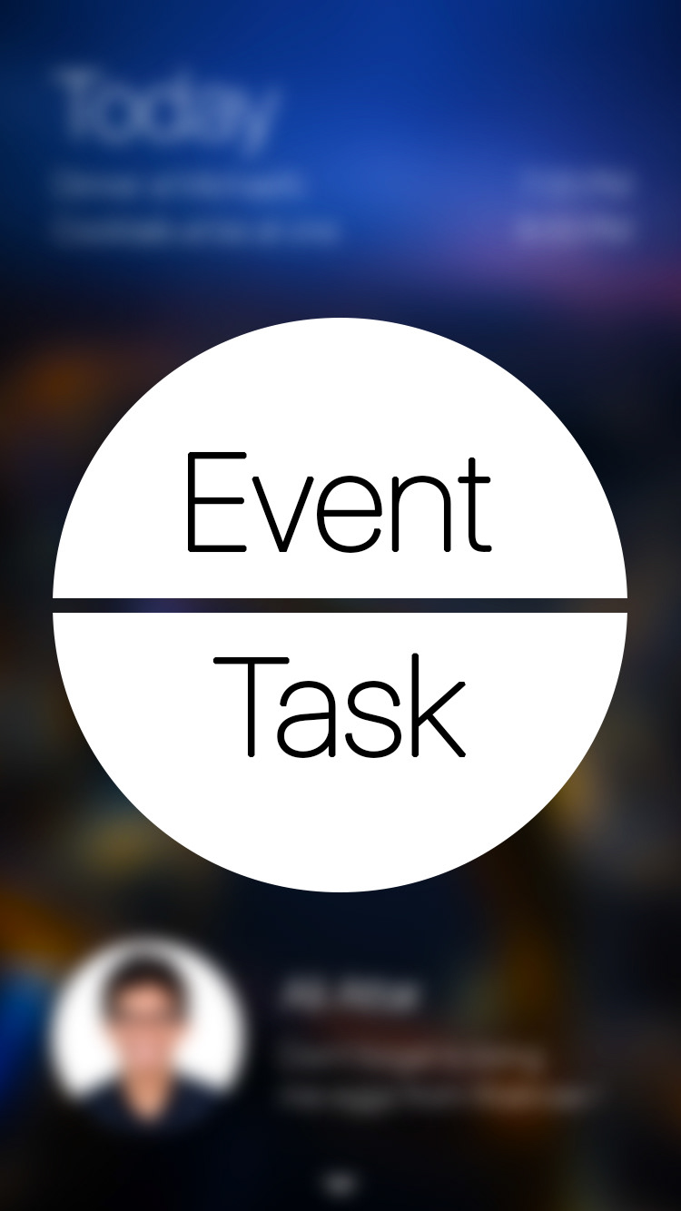
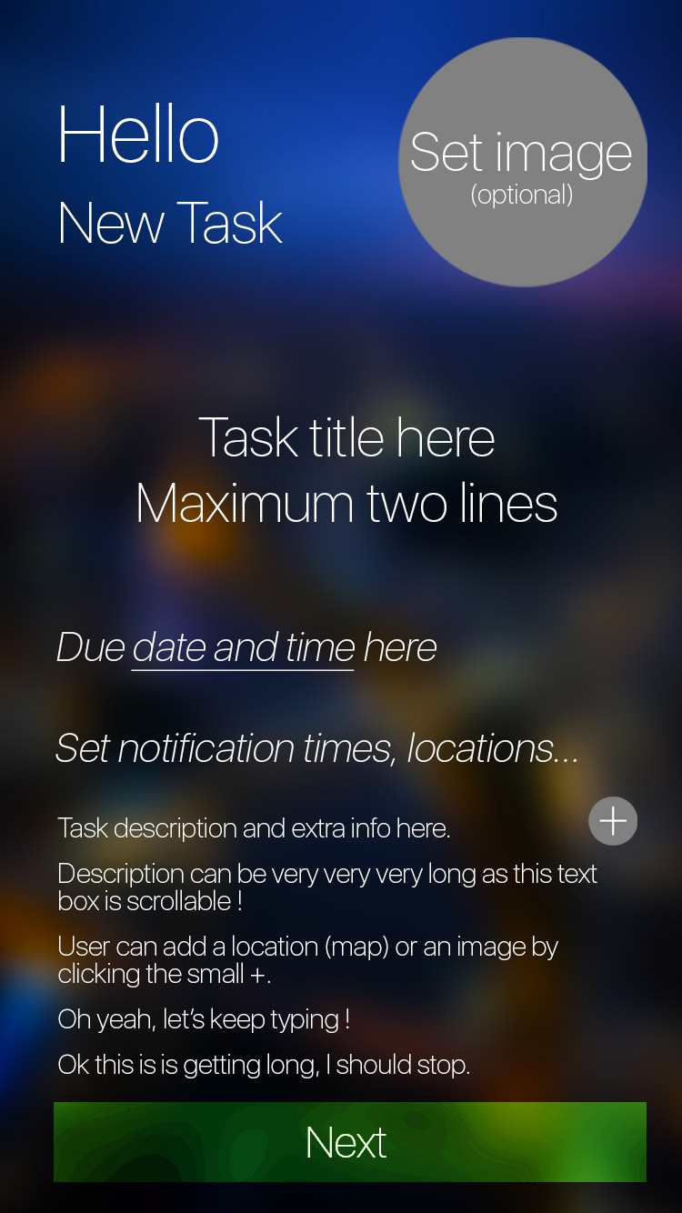
Sending a Hello
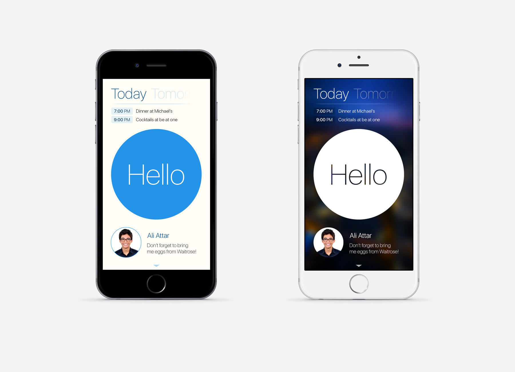
There are two design for sending Hellos.
The first one is the initial idea, considering all hellos behave similarly.
The second one enable more complex hellos and the differentiation between two kinds of hellos: which behave as classic hellos (reminders) and Events to organise small gatherings or activities.
The first one is the initial idea, considering all hellos behave similarly.
The second one enable more complex hellos and the differentiation between two kinds of hellos: which behave as classic hellos (reminders) and Events to organise small gatherings or activities.
It seems like the second one will be closer to the final design.
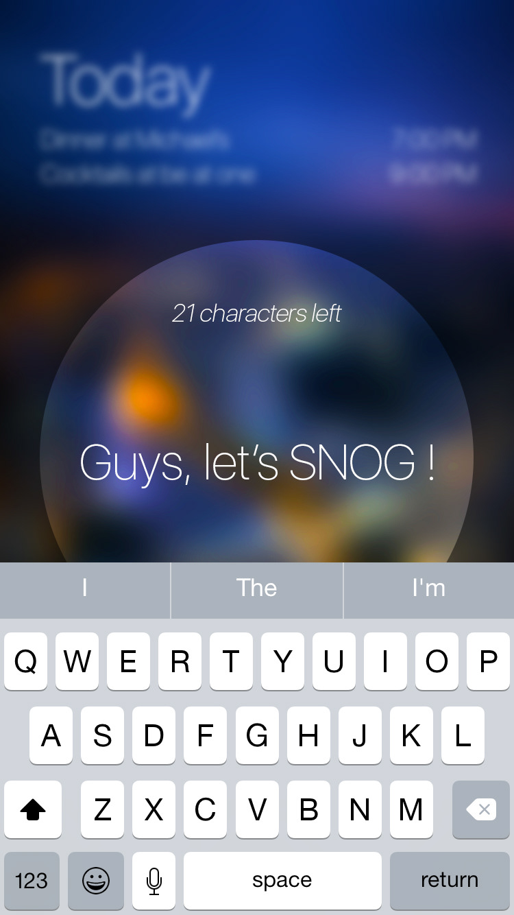
Note: SNOG is a frozen yoghurt place in South Kensington. "Let's SNOG" refers to the activity or going to get a frozen yoghurt for Imperial College students.
Tasks View
Swiping down from the main screen, unveils the "Tasks" view.
The big Hello button goes to the top left and the rolling task in the main screen goes to its position.
The big Hello button goes to the top left and the rolling task in the main screen goes to its position.
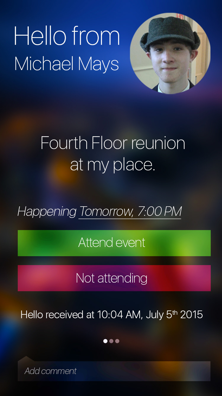
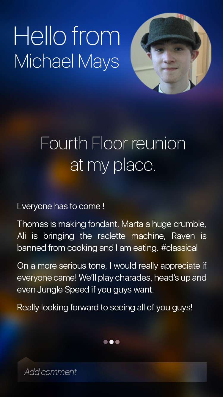
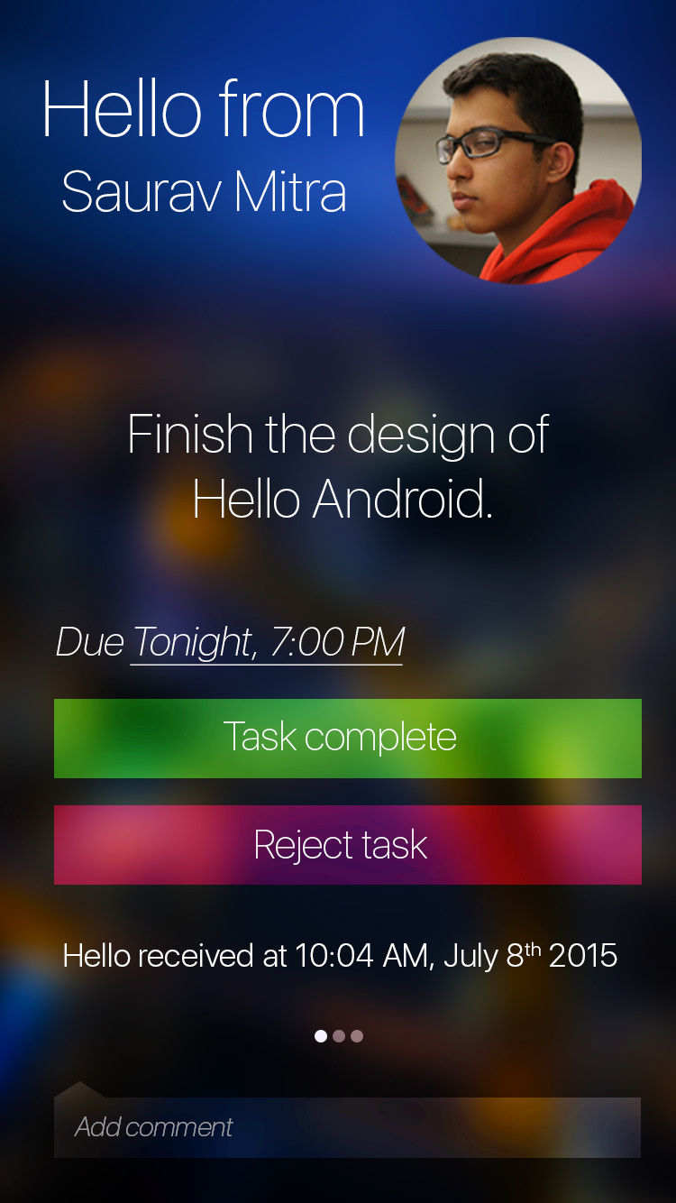
Viewing Hellos
This is what hellos look like! Information is now tabbed. First tab corresponds to the status, second tab is the description and other contain the rest of the information (who is attending an event, a map, or any kind of extra information).
The first two screens are an event's first two tabs, and the next two are those of a task.

Thank you!
Thank you for taking a look at our project! Please visit www.theblurr.io for more details and feel free to contact us for any queries at team@theblurr.io.